This morning I decided that today is the day to begin working in GITI again, primarily adding functionality that I feel will be crucial to the structure of graduate school work. The feature I intend to add is assignment dependency, which essentially means that major assignments could be broken down into smaller assignments that could have independent due dates and assignment information.
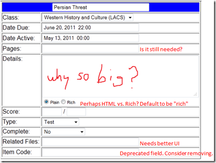
The first thing I decided was that for initial UI I would use only existing GITI pages, and not create a new workflow of any type, given the impending implementation of v3’s framework. The existing pages in GITI that would be used are the basic assignment edit and assignment view pages. The pages would simply receive new queries to handle the change. Starting this process I discovered something I had forgotten… the edit page is absolute crap. The edit page received no major help after being moved to v2, it still retains a lot of v1’s style, especially the gross overuse of the plain text field…. even though those fields now get translated before going to the database. One of the least sensible things about the form itself is the way that files are handled. The field implies it takes multiple files… it doesn’t, but the overall file record system does, so its one of those things where the user interface is awful for a feature that isn’t so bad (it tracks filenames for assignments, increasing the efficiency of organization).
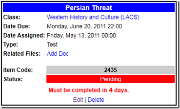
Surprisingly, that complicated input comes with a pretty clean-looking output:
In this particular example, the fields that aren’t used are simply not displayed, but for the edit form, that simplistic approach doesn’t work, since GITI isn’t psychic and does not know what the user needs.
I am going to have to clean things up if they are going to make any sense to the overall workflow of an assignment in GITI.


Please don’t make GITI psychic. The world isn’t ready.