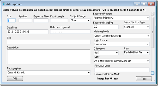
Is this box intimidating? After being away from it for almost 2 years it was intimidating to me when I returned to it a few weeks ago.
Obviously this is not a useful form for anyone that is not both an expert at photography and in data entry. I think this form is absolutely horrendous for basic day-to-day data storage. At the present time I am considering replacing this particular panel with a more slim model and placing this form as a special option for experts and for use on a case-by-case basis where more information may be needed.
I believe the revised form shall only need a few pieces of information:
- Exposure Program (A, S(T), P, M)
- Aperture
- Exposure Time
- Focal Length
- Time of Exposure (Date Time)
- Exposure Bias
These options would reflect the basic pieces of data that are captured and stored by DSC ExIf at exposure time. While the other data, such as metering mode may be useful it is not something that the average photographer changes very often. Orientation is no longer needed because the user can now adjust that after the images have been mated with their data and visually confirm the transform.
The area that bothers me about making these changes is the loss of special fields such as lens selection, lighting and flash info just because of a need to make the form more user-friendly. I am considering the idea of a pop-out panel that will allow the user to select these pieces of data.
Another area that is particularly difficult for me at the moment is considering what my data-retention policy in the application will be. I can usually safely remember user and lens. What about the other form elements? Should they keep their values or reset to zero when they are hidden?
There is a lot to consider regarding the improvement of the user experience for ExIf35.
